
[PT/BR]
Sobre
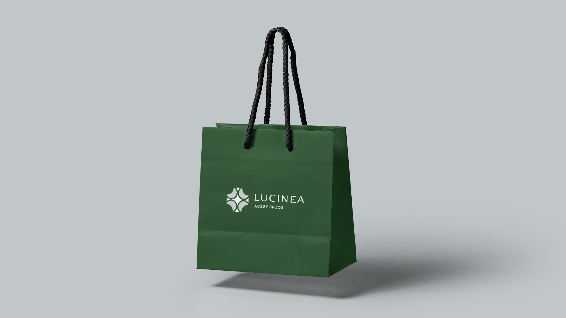
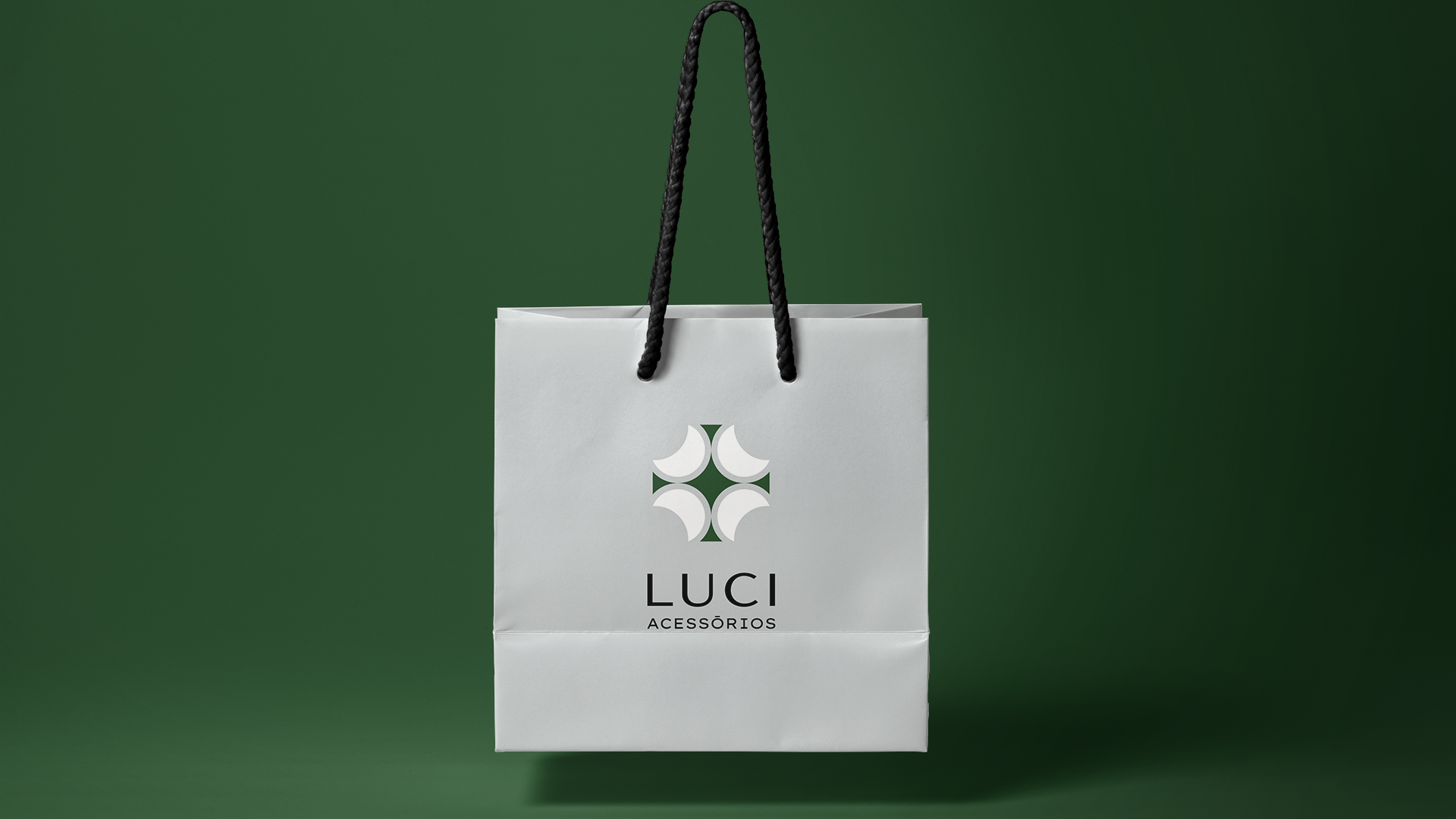
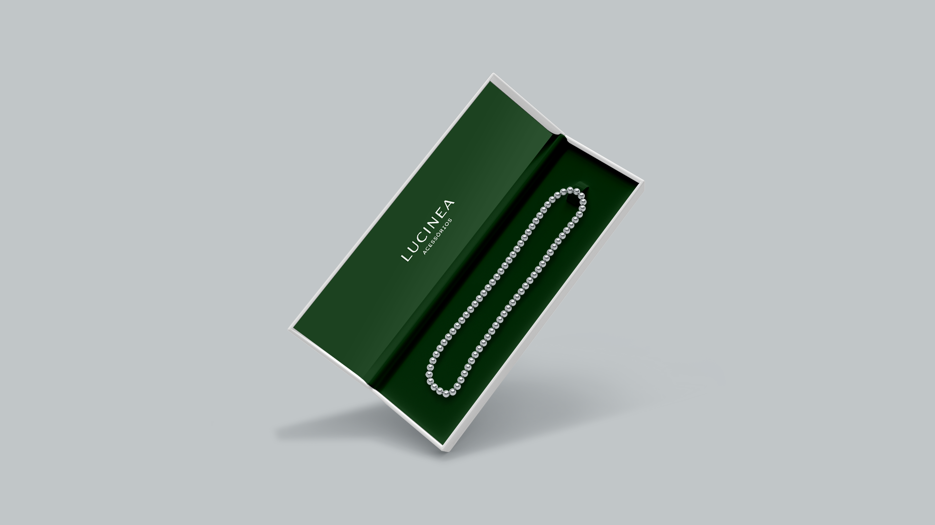
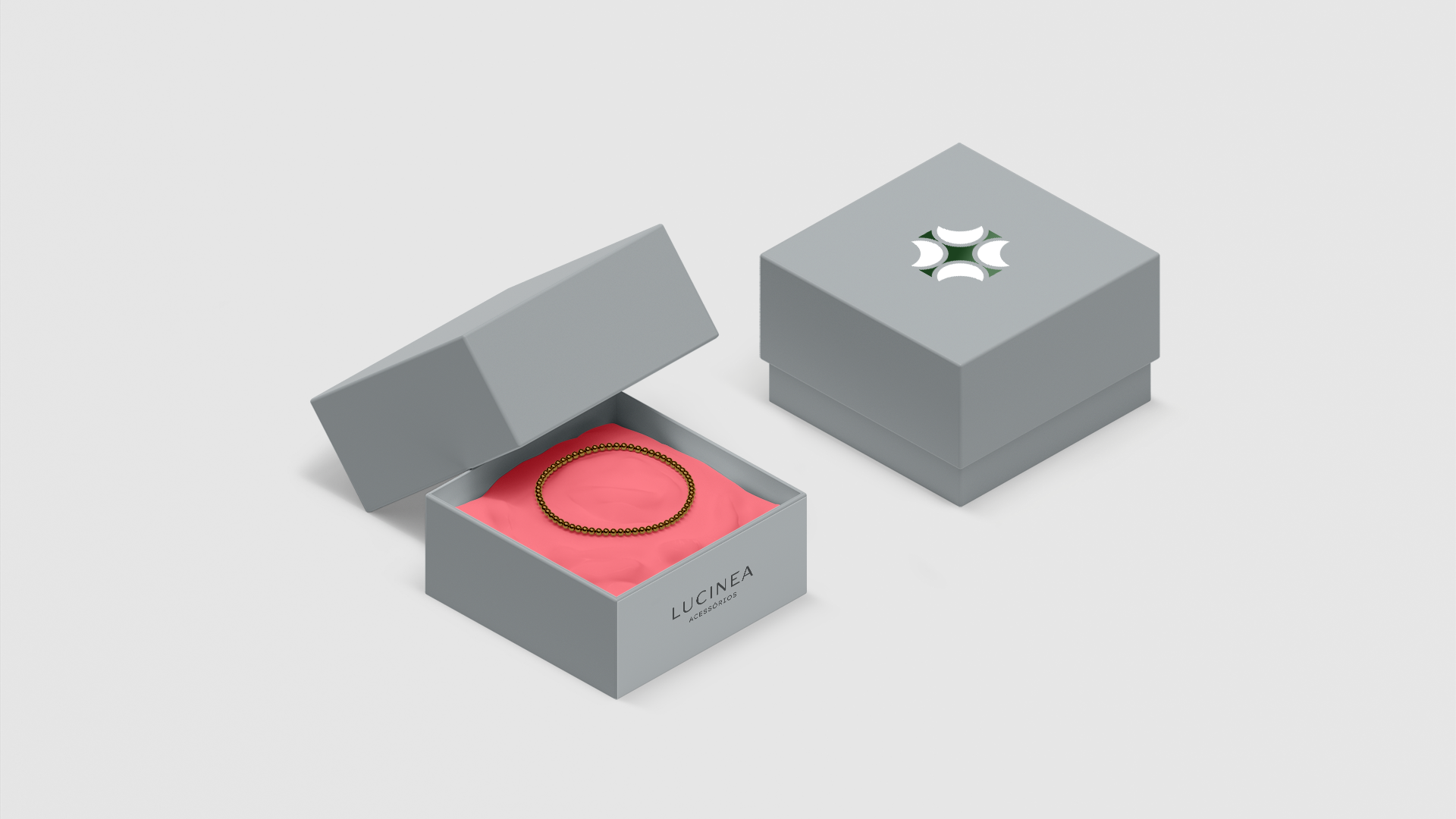
Lucinea é uma marca de semi joias e acessórios femininos empenhada em oferecer qualidade de forma acessível aos seus clientes.
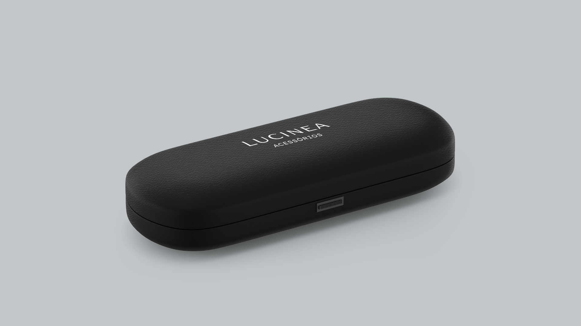
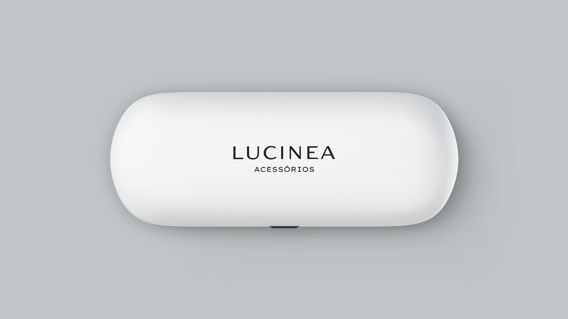
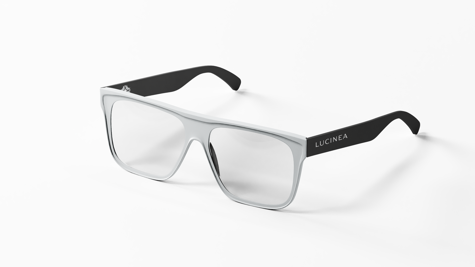
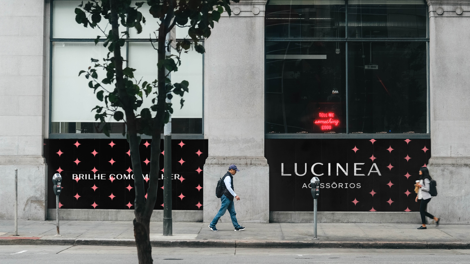
Desde o início do projeto notou-se a necessidade de transmitir através da identidade visual atributos que comunicassem sofisticação ao público da Lucinea, porém sem limitar a comunicação da marca a apenas acessórios, levando em conta que a marca pretende expandir para o mercado de calçados futuramente. A Identidade deveria ser versátil a ponto de atender pontos de contato com uma vizualização reduzida como a armação de óculos, favicon (ícone de página de site), acessórios e a foto de perfil do instagram, principal rede social da marca.
Desde o início do projeto notou-se a necessidade de transmitir através da identidade visual atributos que comunicassem sofisticação ao público da Lucinea, porém sem limitar a comunicação da marca a apenas acessórios, levando em conta que a marca pretende expandir para o mercado de calçados futuramente. A Identidade deveria ser versátil a ponto de atender pontos de contato com uma vizualização reduzida como a armação de óculos, favicon (ícone de página de site), acessórios e a foto de perfil do instagram, principal rede social da marca.
Solução
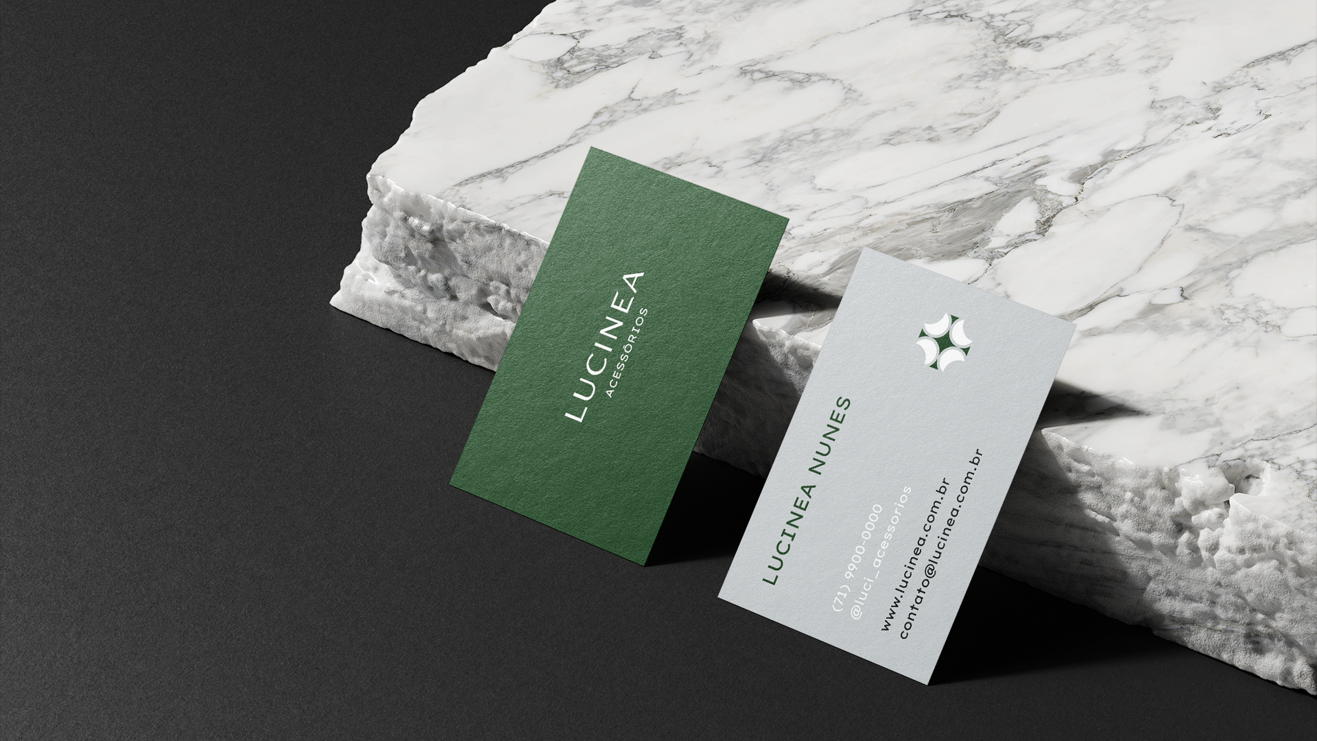
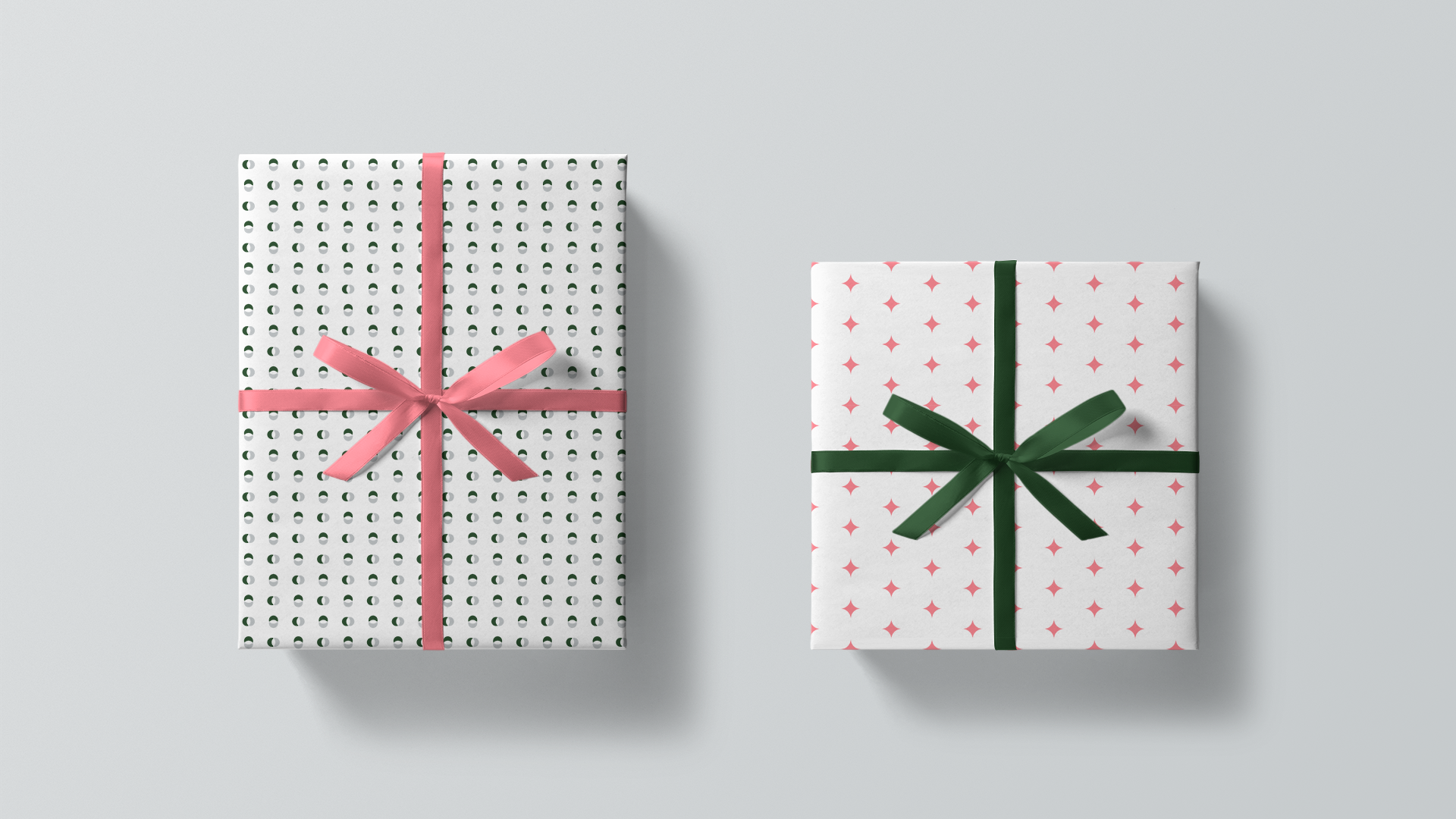
Através da pesquisa de mercado foi analisado que o segmento de semi joias e acessórios utilizam de forma extensiva aplicações em metálico como o dourado/prateado para transmitir sentimentos de luxuosidade. Para diferenciar-se dentro do nicho de atuação da marca optou-se uma abordagem próxima do que as marcas de moda fazem, usando a estética monocromática/minimalista junto a paleta verde/cinza/rosa escolhida para a marca transmitindo sentimentos de elegância e exclusividade ao seus clientes ao contrário do simplesmente luxuoso e caro. O resultado final é uma marca atraente que consegue ser forte e elegante ao mesmo tempo que é leve e discontraída conectada com o público-alvo da marca.
[EN]
About
Lucinea is a brand of semi-jewelery and women's accessories committed to offering quality in an affordable way to its customers.
Since the beginning of the project, the need to transmit attributes that communicate sophistication to Lucinea's public through the visual identity was noted, but without limiting the brand's communication to only accessories, taking into account that the brand intends to expand into the footwear market in the future. The Identity should be versatile to the point of meeting points of contact with a reduced view such as the glasses frame, favicon (website page icon), accessories and the profile picture of Instagram, the main social network of the brand.
Since the beginning of the project, the need to transmit attributes that communicate sophistication to Lucinea's public through the visual identity was noted, but without limiting the brand's communication to only accessories, taking into account that the brand intends to expand into the footwear market in the future. The Identity should be versatile to the point of meeting points of contact with a reduced view such as the glasses frame, favicon (website page icon), accessories and the profile picture of Instagram, the main social network of the brand.
Solution
Through market research it was analyzed that the segment of semi-jewelery and accessories extensively use metallic applications such as gold / silver to convey feelings of luxury. In order to differentiate within the brand's operating niche, an approach close to what fashion brands do was chosen, using the monochrome / minimalist aesthetic along with the green / gray / pink palette chosen for the brand, conveying feelings of elegance and exclusivity to the your customers as opposed to simply luxurious and expensive. The end result is an attractive brand that manages to be strong and elegant while being light and relaxed connected with the brand's target audience.

[PT/BR]
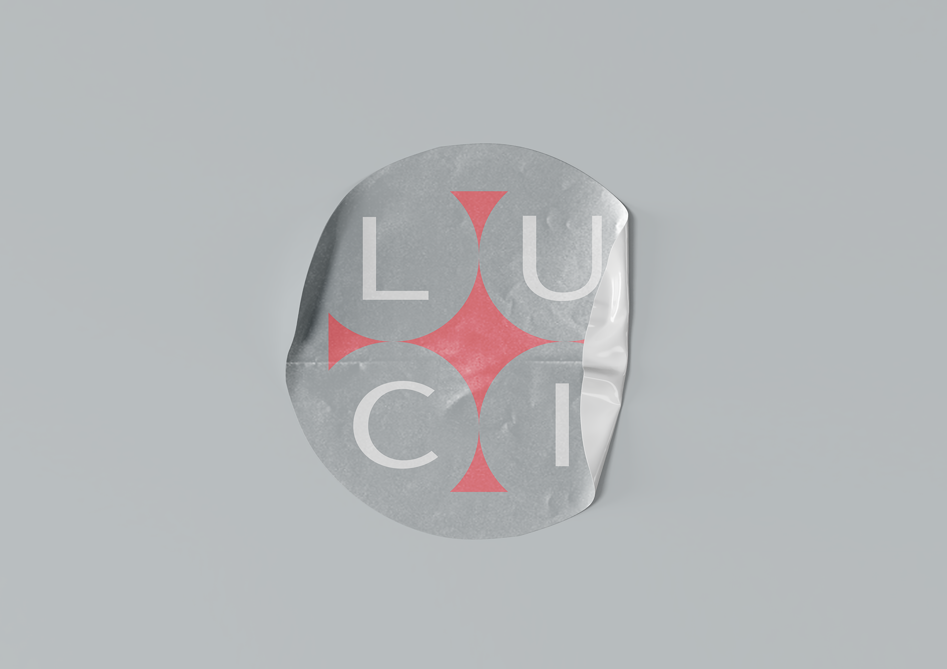
CONCEITO
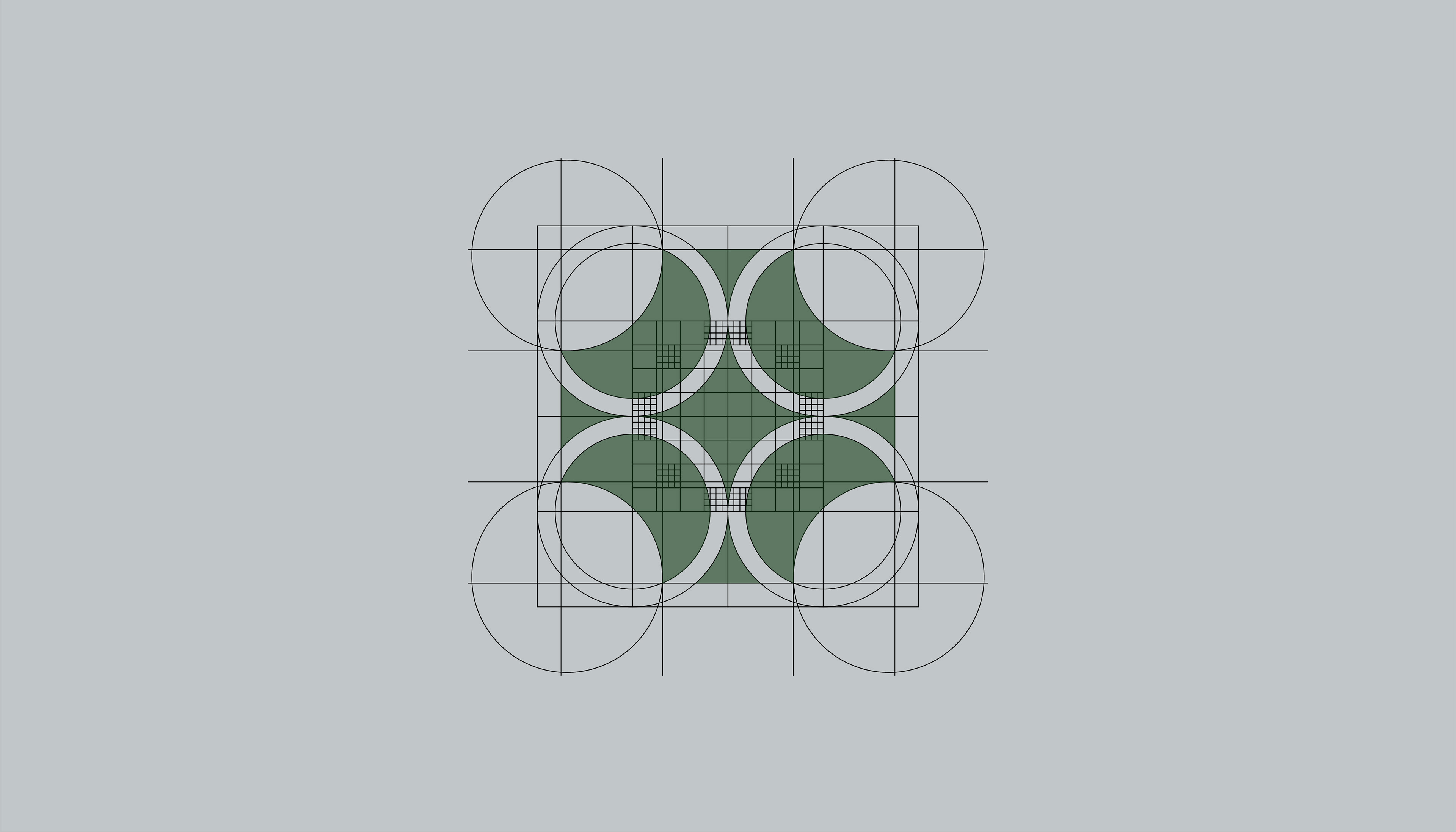
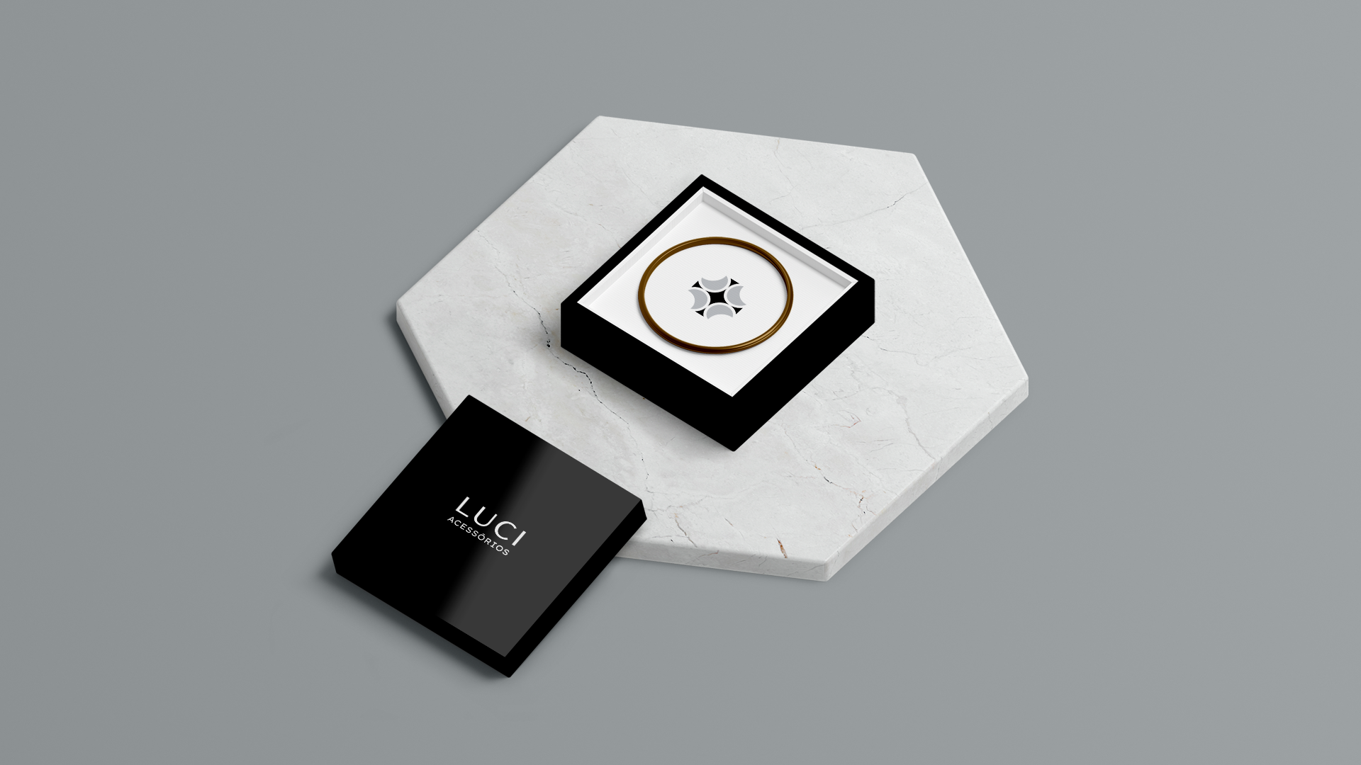
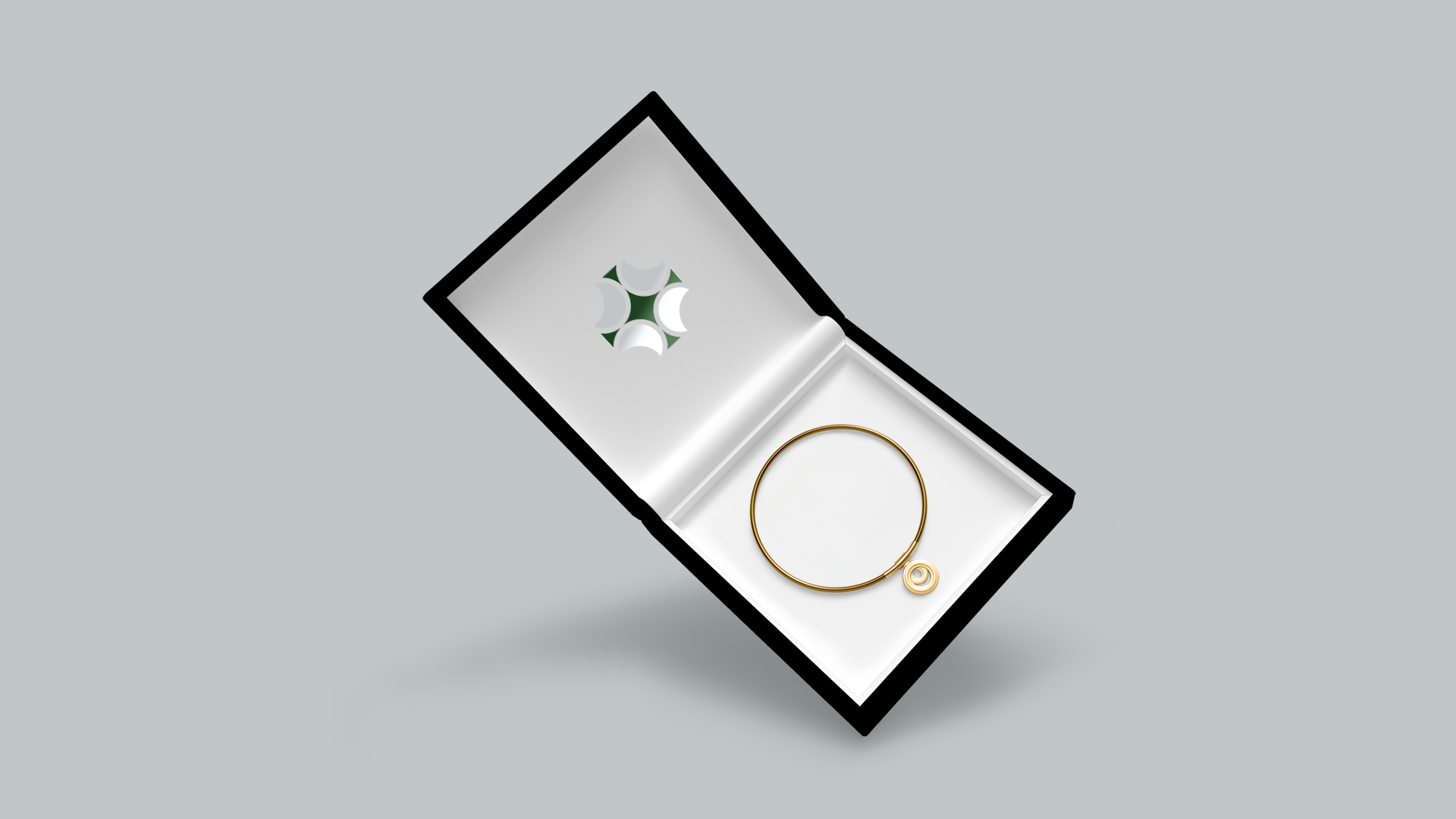
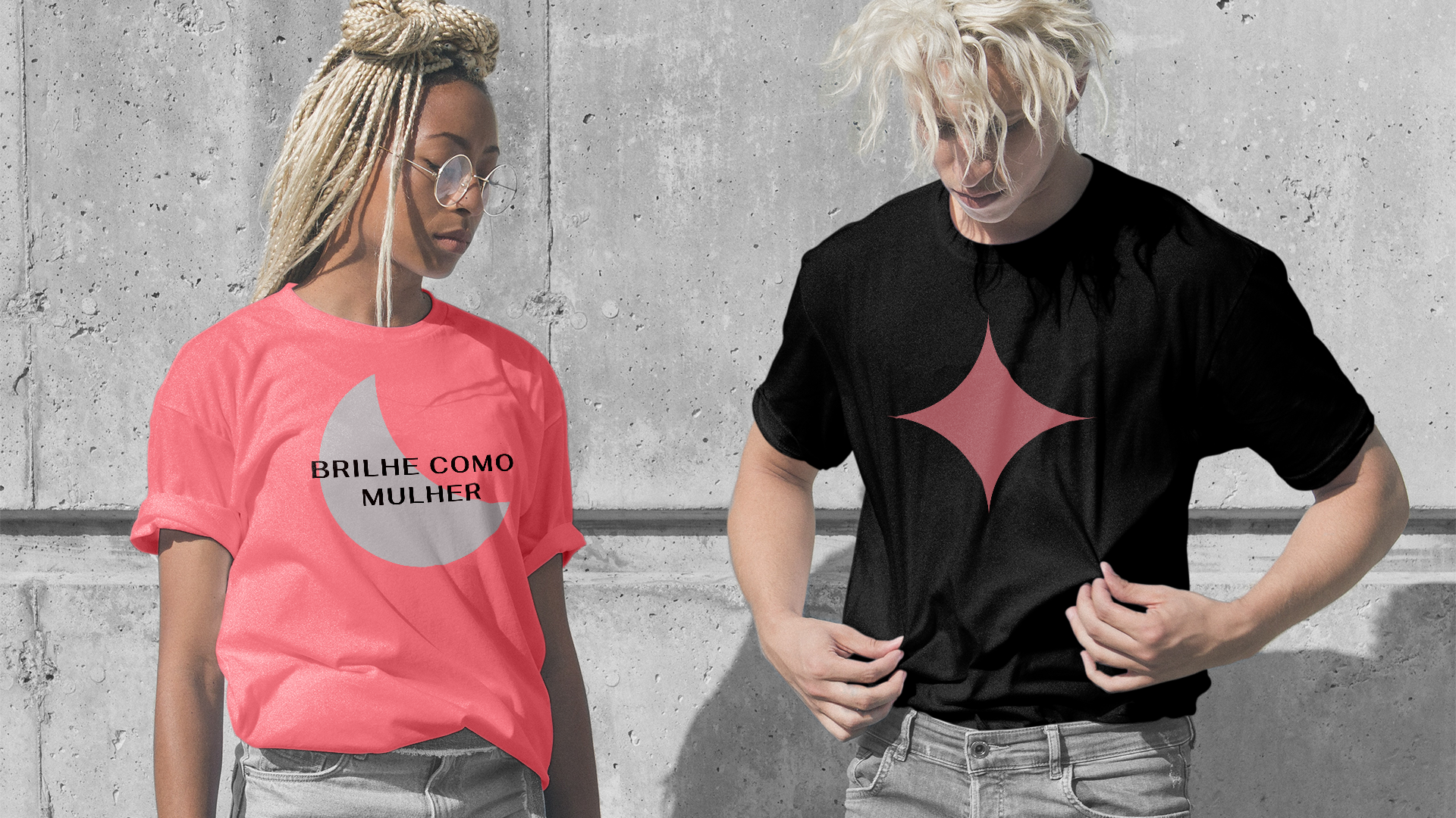
A Lua tem um brilho prateado, evidenciando o principal carro-chefe da marca, a Prata 925 (Prata Esterlina). Na verdade o valor dela é tão simbólicamente associado ao da Prata que os Egípcios usavam o símbolo da Lua para a identificar o metal. A Lua é também o próprio símbolo da feminidade, ela vestisse diferente a cada fase, é o astro dos ritmos da vida pois está sempre mundando de visual.
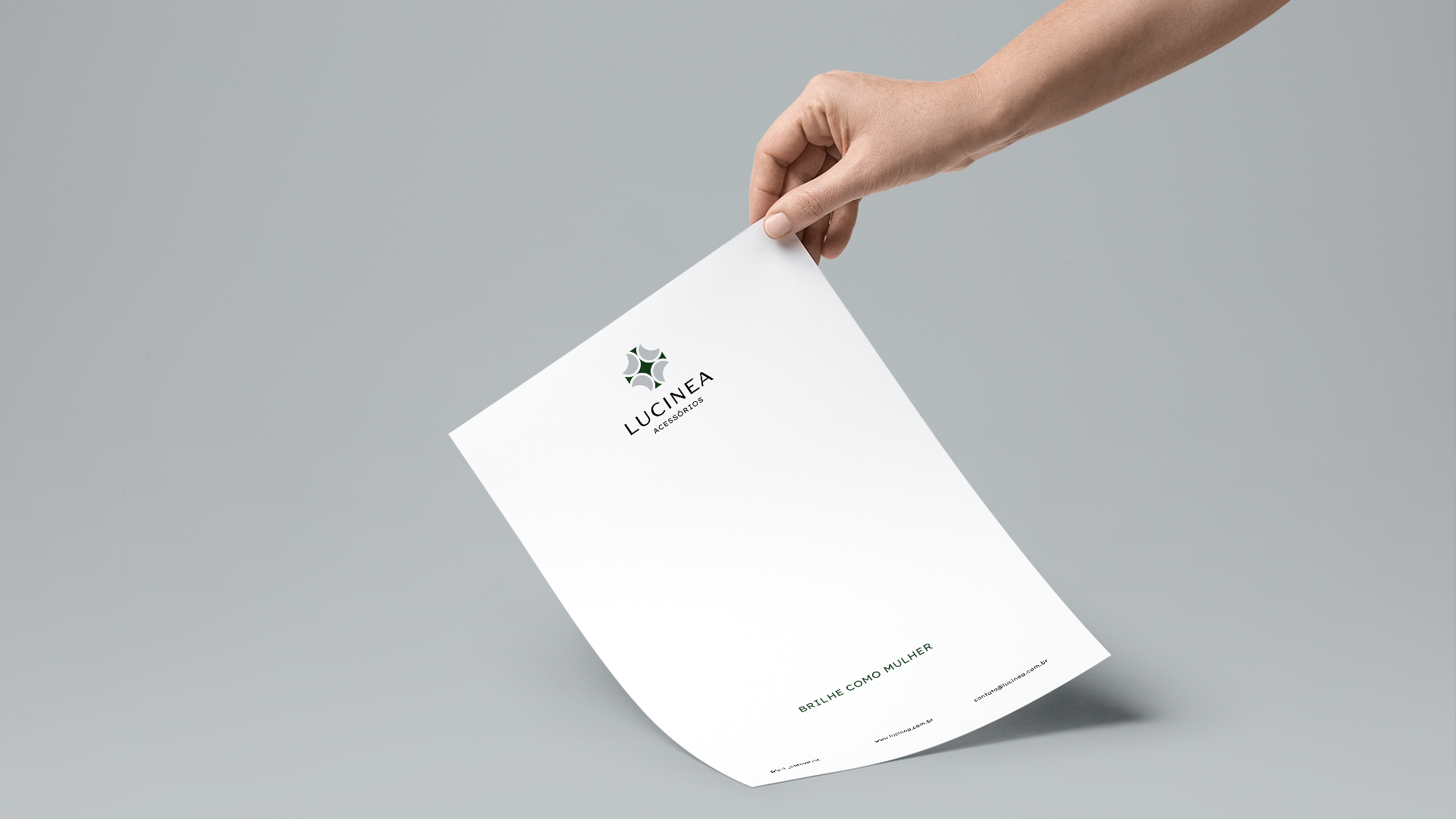
Prata (Lua = Mulher) + Esterlina (Estrela = Brilhante) = “BRILHE COMO MULHER” (Big Idea / Slogan)
A Lua é feminina, é forte e brilha como a Prata. O símbolo remete a um pingente/joia, composto por uma estrela reluzindo luas ao seu redor, expressando que a lucinea ajuda as mulheres (As Luas) a brilharem a sua força feminina através do brilho dos seus acessórios (A Estrela).
Além disso você reparou que a palavra Lucinea possui Lua dentro dela, mostrando literalmente como o público está inserido dentro da marca.
[EN]
CONCEPT
The Moon has a silver luster, showing the main flagship of the brand, 925 Silver (Sterling Silver). In fact, its value is so symbolically associated with that of Silver that the Egyptians used the symbol of the Moon to identify the metal. The Moon is also the very symbol of femininity, she wore different at each stage, she is the star of the rhythms of life as she is always changing her look.
Silver (Moon = Woman) + Sterling (Star = Brilliant) = “SHINE LIKE A WOMAN” (Big Idea / Slogan)
The Moon is feminine, strong and shining like Silver. The symbol refers to a pendant / jewel, composed of a star shining moons around it, expressing that the lucine helps women (The Moons) to shine their feminine strength through the shine of their accessories (The Star).
In addition you noticed that the word Lucinea has Lua (Moon in Portuguese) inside it, showing literally how the audience is inserted within the brand.
In addition you noticed that the word Lucinea has Lua (Moon in Portuguese) inside it, showing literally how the audience is inserted within the brand.
[PT/BR]
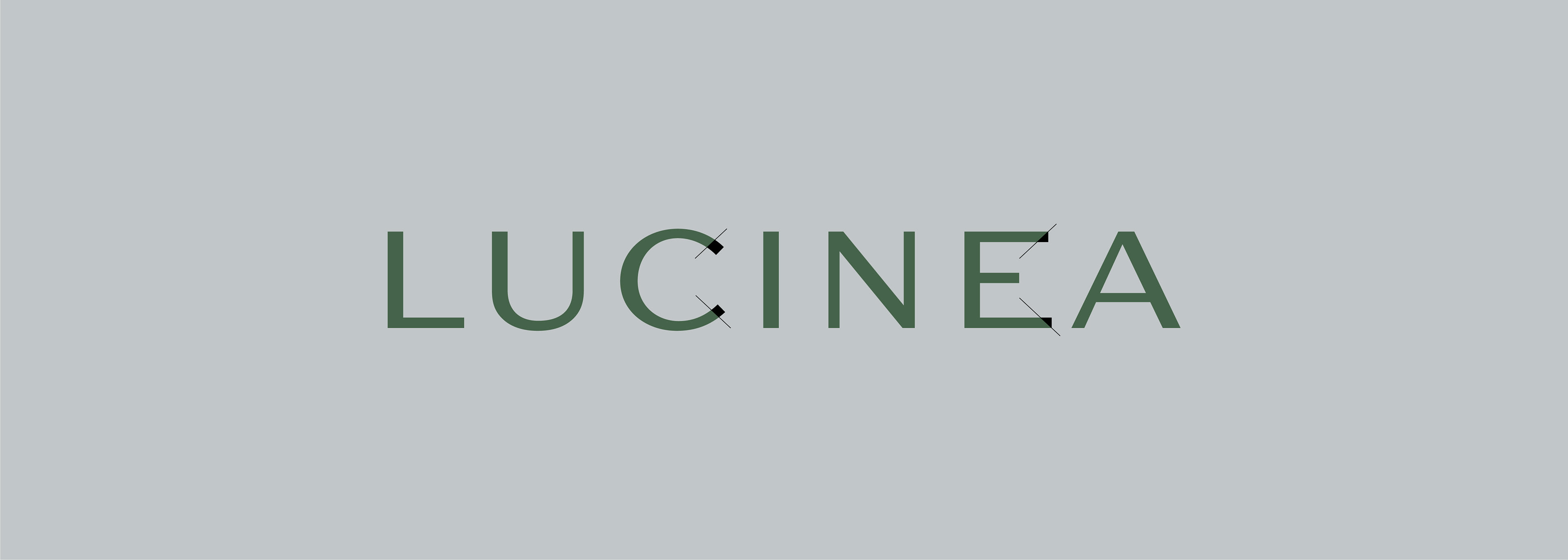
PERSONALIZAÇÃO
Assim como a prata é lapidada e polida para virar uma joia, a tipografia da marca foi personalizada para dar mais exclusividade a personalidade ao logotipo. Foram feitos cortes na letra C e E do logotipo, em uma orientação de 47° graus - número atômico da Prata.
[EN]
PERSONALIZATION
Just as silver is polished and polished to become a jewel, the brand's typography has been personalized to give more personality to the logo. Cuts were made in the letter C and E of the logo, in an orientation of 47 ° degrees - the atomic number of the Silver.


OBRIGADO / THANK YOU
Vamos criar um projeto incrível juntos?
Let's create an amazing project together?
Quer conversar comigo?
Do you want to talk with me?